
Introduction
The Nepal Academy of Tourism and Hotel Management (NATHM) recognised the need to redesign its website to better serve prospective students, current students, and stakeholders. The objective was to create a user-friendly, visually appealing, and informative online presence that enhanced user experience while streamlining access to key information.
Problem Statement
The existing NATHM website faced several challenges:
- Outdated Design: The look and feel did not reflect modern web design standards.
- Disorganised Information: Content was scattered and difficult to navigate.
- Usability Issues: Users struggled to find information quickly, leading to frustration and disengagement.
Objectives
The main goals of the redesign were to:
- Enhance User Experience with a modern, intuitive design.
- Improve Information Organization by streamlining content and navigation.
- Maintain NATHM’s Unique Identity while aligning with contemporary digital standards.
Process
The redesign followed structured phases to address existing issues:
- Hero Section Audit
The hero section was simplified to ensure a clear and impactful first impression.
2. User Personas
Personas were developed to ensure the new design addressed the needs of different user groups, including prospective students, current students, and faculty.

Approach
- Analysis
Screenshots of each existing page were reviewed to map the information architecture and identify redundancies.

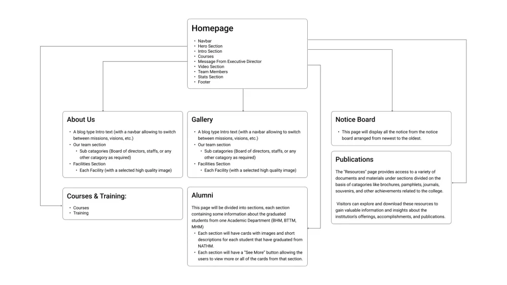
2. Information Architecture
Content was reorganized, grouping related elements together while eliminating unnecessary sections.
3. Design Inspiration and Ideation
Leading educational websites such as Stanford University and St. Xavier’s College provided design benchmarks.

Research
Wireframing
Mid-fidelity wireframes were created to visualize improved layouts and navigation, focusing on better information flow and accessibility.

Designs
Example 1 – About Us Page
- Problem: Information was scattered across six different pages.
- Solution: Consolidated into a single page with toggle navigation for easier access.

Example 2 – Courses Page
- Problem: A large, low-resolution image and lengthy text blocks made navigation difficult.
- Solution: Content chunking and toggle navigation were applied for clarity and efficiency.

Development & Production
While the redesign emphasized design and usability, equal attention was given to development and long-term scalability:
- CMS Choice: October CMS was selected to provide a fast, lightweight, and developer-friendly backend. WordPress was not preferred due to slower performance and heavier overhead.
- Performance Optimization: The site was built with optimized asset loading and caching strategies, ensuring fast response times for both desktop and mobile users.
- Content Management: October CMS empowered NATHM staff with an easy-to-use admin panel, simplifying updates without requiring deep technical knowledge.
- Deployment & Maintenance: The system was deployed with monitoring and regular updates, ensuring security and ongoing stability in production.
Conclusion
The redesign of the NATHM college website successfully combined modern design with robust development. The new site delivers a streamlined user experience, intuitive navigation, and improved performance. By consolidating information, leveraging October CMS for efficient content management, and maintaining a clean layout, the website now meets the goals of enhancing user experience, improving information organization, and preserving the unique identity of NATHM.